EPHEMEROS
EPHEMEROS is a quarterly print magazine inspired by vintage craft, design, and illustration. The content features DIY and vintage culture as well as music, art, tashion, photograpny, craft, and humor. A playful exploration of creativity, vintage ephemera and typography are some common elements. The brand is offbeat with a unique, hand-crafted design aesthetic. Ephemeros is for all people influenced by a love of old things: vintage sellers, collectors. stylists. musicians. and other creatives who have immersed themselves in the aesthetics of bygone eras.

MAGAZINE
CONTEXT: MCAD TYPOGRAPHY CLASS
MEDIUM: DIGITAL
TOOLS: ILLUSTRATOR, PHOTOSHOP, INDESIGN
RESEARCH METHODS: BOOKSTORES, GOOGLE, COLLEAGUES
DESIGN ELEMENTS: NAMING, BRANDING, LOGO, MOODBOARD, STYLE GUIDE, TABLE OF CONTENTS, ONE PAGE ARTICLE, THREE PAGE FEATURE, LETTER TO THE EDITOR
A fictional quarterly print magazine inspired by vintage craft, design, and illustration. The content features DIY and vintage culture as well as music, art, fashion, photography, craft, and humor. A playful exploration of creativity, vintage ephemera and typography are some common elements. People aged 30-60 who are influenced by a love of old things: vintage sellers, collectors, stylists, musicians, and other creatives who have immersed themselves in the aesthetics of bygone eras. The brand is offbeat
STYLE GUIDE
Typography as the hero along with elements that feel hand-crafted. Vintage photography and illustrations modern photography and illustrations with a vintage aesthetic. Quality and consistency troughout without monotony. Imperfections and character are an important part of the aesthetic.
TYPE EXPLORATION
COVER DESIGN
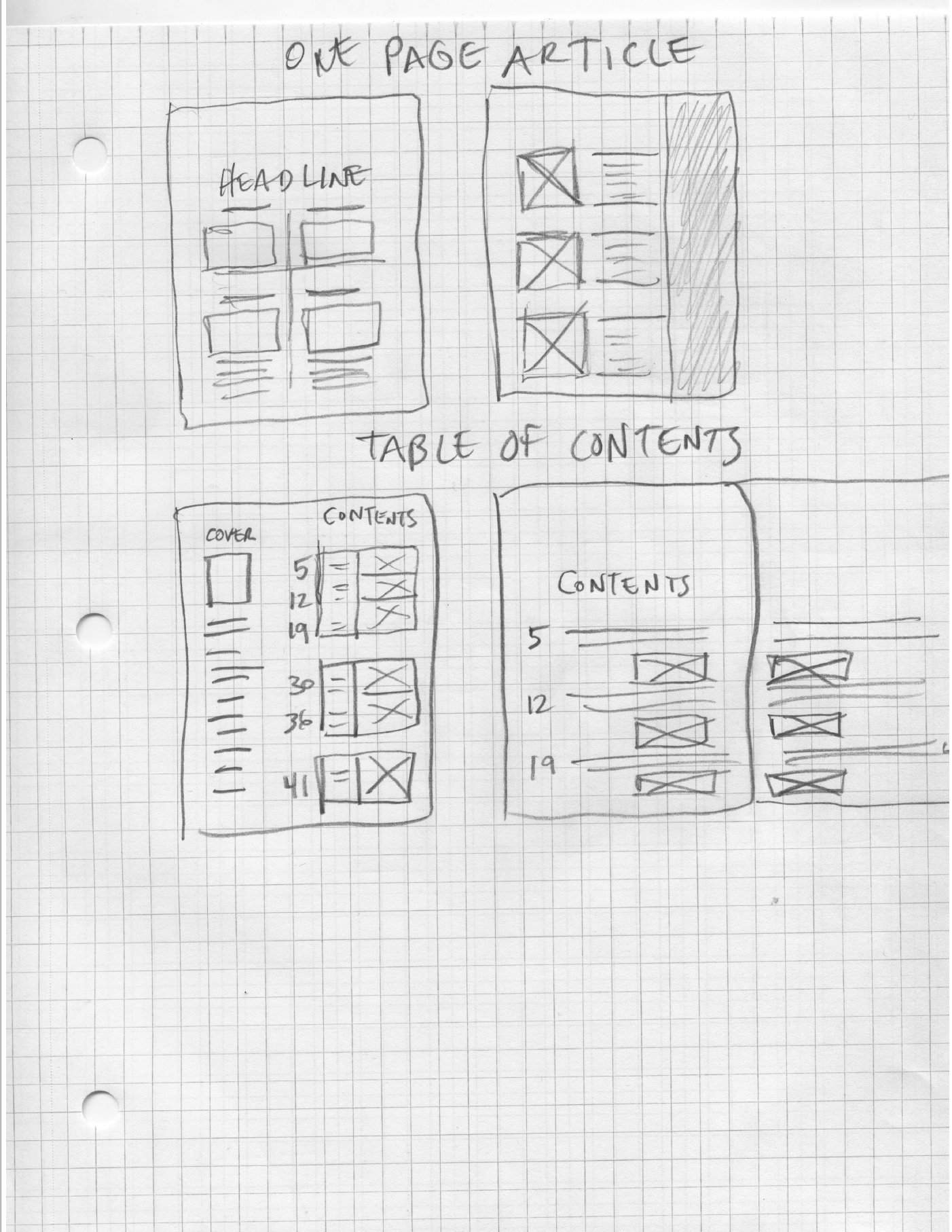
SKETCHES
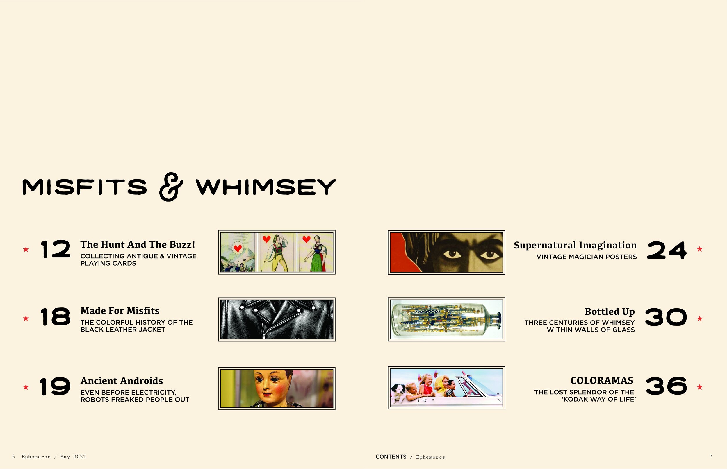
TABLE OF CONTENTS
PAGE design layouts
one page feature
THE ART OF MAGIC has been enchanting and astounding people for a long time. By the late 19th century, magicians were performing for large audiences. Posters were a popular way to advertise and set performers apart from their peers; even the most famous magicians needed flyers: to draw crowds. The ads used bright colors and sinister imagery to capture the imagination of potential audience members.
FINAL THOUGHTS
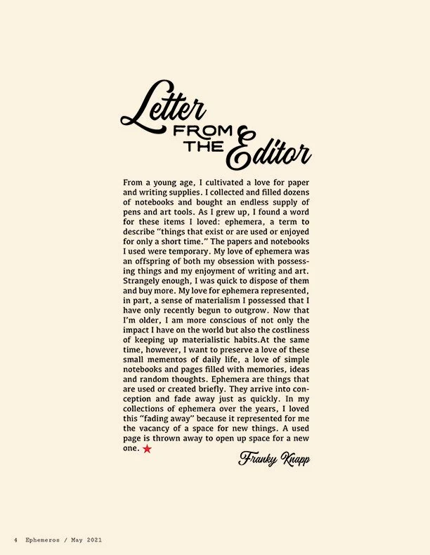
I was really happy with the typography and white space on this Letter from the Editor design. If I had to do it again, I would save that lonely “one” from it’s orphan status. Luckily, the red star and signature are there to give it some company.


