TOPO CHICO WEBSITE REDESIGN
Topo Chico is premium, imported, sparkling mineral water that has been sourced at the same spot in Mexico for more than 120 years. Topo Chico has a loyal base of consumers who grew up with the brand in Mexico and Texas. In 2017, Coca-Cola purchased Topo-Chico for $220 million, helping popularize it across the United States. The drink has achieved cult status, garnering a massive Millennial following. Topo Chico targets hip, young consumers by sponsoring music festivals and artist collaborations.

CONTEXT: MCAD WEB DESIGN CLASS
MEDIUM: DIGITAL
TOOLS: FIGMA, PHOTOSHOP, ILLUSTRATOR
RESEARCH METHODS: GOOGLE, COLLEAGUES
THE PROBLEM:
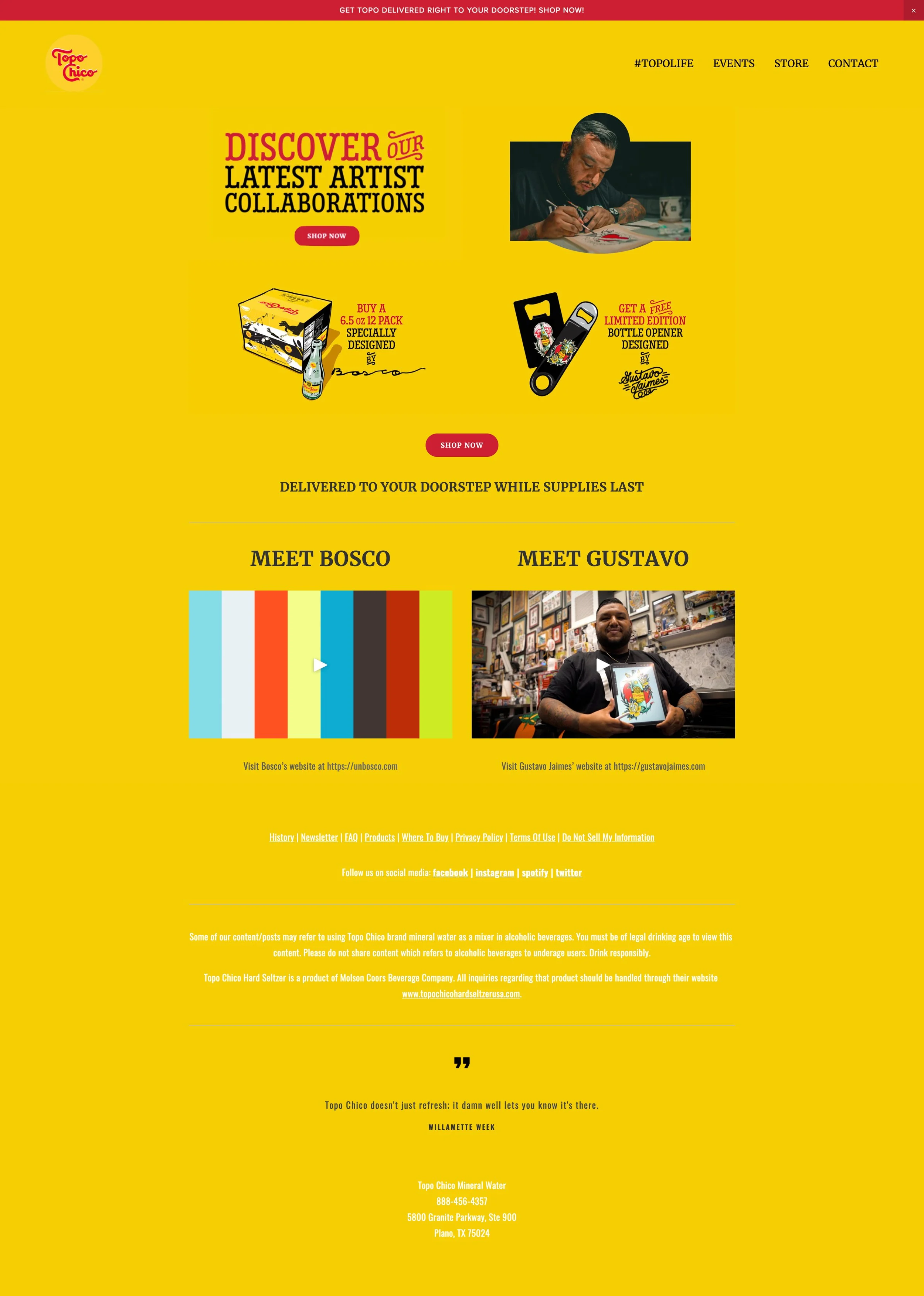
What is wrong here? There are no pictures of the beverage on the website! The navigation is confusing and limited. The links are white on yellow. The logo yellow doesn’t match the background. With so many sparkling water choices on the market, Topo Chico could miss out on reaching new audiences.
THE SOLUTION:
LET THE TOPO CHICO SPEAK FOR ITSELF! It has a cult following, why advertise to the cult? Share the love! For such a charming brand, Topo Chico deserves a well designed and cleverly curated website while maintaining design consistency and maintaining their brand legacy.
WEBSITE REDESIGN

Topo Chico
Brand personality: authentic, cool, laid back, reliable, homegrown.
Brand colors: yellow, red, white, black
Brand mark: hand drawn logotype, trademark
APPROACH: A simple yet bold system

STYLE GUIDE
RESEARCH
I conducted a competitive web analysis of the top four premium sparkling waters Topo Chico, Perrier, S.Pellegrino, and Mountain Valley Spring Water. Each brand is deeply rooted in their own heritage, value, and iconic identity.
I also held an impromptus focus group with three men of a similar age and background to Dan, Topo Chico is considered a revered beverage among their friend groups. Surveying the current website with the focus group, the users felt the website lacked information, clarity and really missing good design.

MOODBOARD
Incorporated more text and engaging content to expose Topo Chico to a much wider audience. Expanded the color palette while keeping the primary brand colors strong. Used photographs of healthy foods and non-alcoholic Topo Chico recipes.
The bottle cap flip animation was my great achievement. :)
We discussed hamburger menus as a standard that could be questioned. The navigation system is captivating and original, pushing the user to discover the product. Bringing back the vintage logo and keeping the playful spirit of the company will help Topo Chico cement their legendary product in the forefront of the flourishing billion dollar sparkling water industry.
